a transparent volume for maximum user-friendliness
a transparent volume for maximum user-friendliness
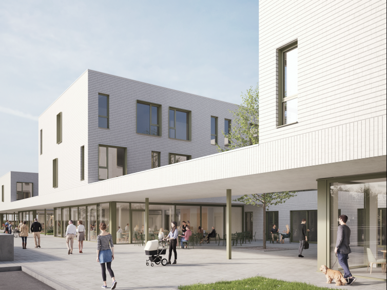
The Sint-Jozef care campus is the result of a competitive design tender involving the development of a master plan for the entire site and an architectural design for the new building.
In consultation with the neighbourhood, every effort was made to ensure:
In order to avoid a major contrast with the surrounding buildings, the construction height of the new building has been deliberately limited to three floors.
The new care campus will be located at the rear of the site, preserving the existing trees and with limited demolition of the existing building.
| program | new replacement building construction for 135 residents at the new Sint-Jozef care campus |
| client | CPAS Courtrai |
| address | Condédreef 16 • 8500 Courtrai |
| building type | care • learn • live |
| status | under construction |
| expertises | architectureinterior architecturebimlandscape designurban design & planningproject managementhealth & safety coordinationprogramming |
| offices | antwerp |
| size | basement: 3.150 m² • above ground: 8.975 m² |
| team | • client: CPAS Courtrai • structural engineering: BM Engineering • fluid engineering: BM Engineering |
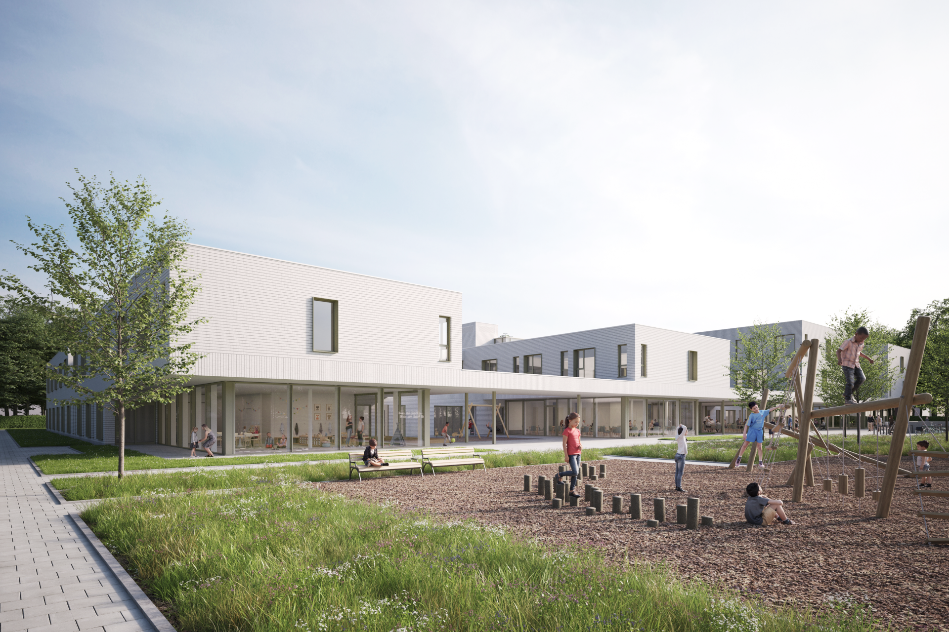
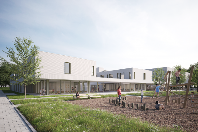
Heavy goods traffic will pass through the existing central driveway on the Condédreef and be directed as far as possible to the right of the plot. The aim is to preserve as large a green area as possible for the building, which will be landscaped as a park, with areas for horticulture and a new play area. The green area behind the new building, which will be used mainly by the residents of the residential care facility, will have a more private character. The open spaces between the rear wings of the building open onto this private garden park but can also be closed off.
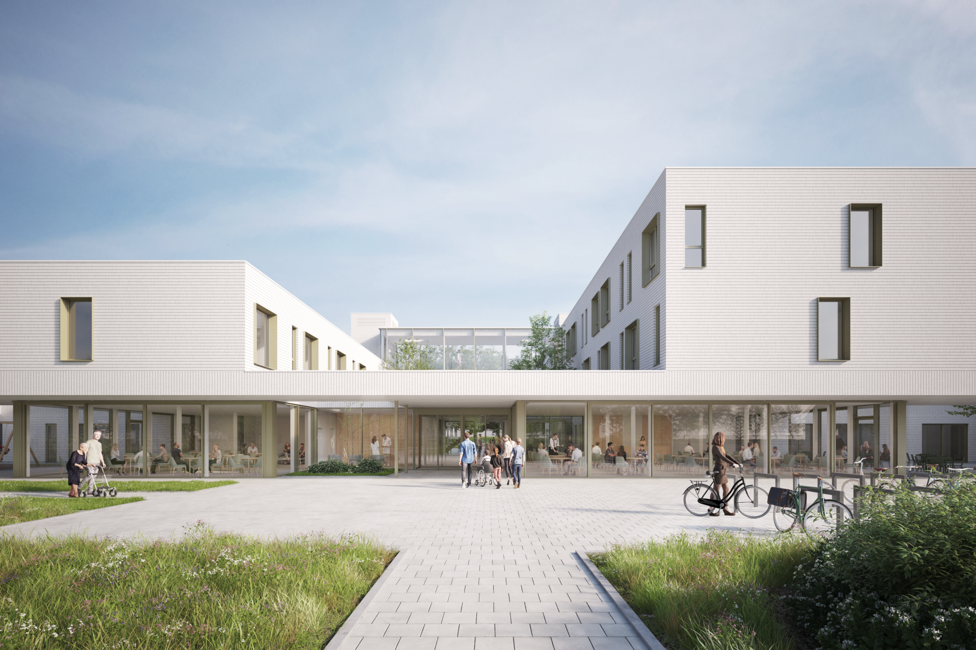
The main entrance is located in the centre of the boulevard and gives access to the central staircase and the visitor lifts. The residential care facility consists of eight separates, orthogonally connected building blocks, the size of a “private residential home”. These residential houses are perpendicular to the pedestrian boulevard so that all rooms have an east-west orientation. The rhythmic configuration of the residential houses (with open spaces between them, on the scale of a wide street) generates the contrast between open and built-up spaces.
The living spaces, located next to the open spaces, each have an unobstructed view of the surroundings and provide transparency throughout the building. Each section of the residential care facility has 2 living groups with 16 rooms. Each living group has 2 residential houses with 8 rooms, which are clearly visible in the architecture. From the outside, they already convey the modest, human scale and user-friendliness of the project.
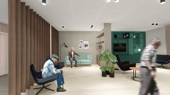
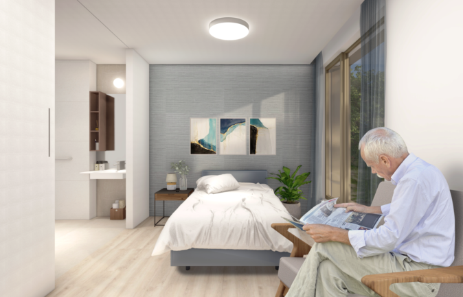
The choice of maximum user-friendliness was also made for reasons of functionality. There is no central kitchen. Each living group has its own kitchen, where meals are prepared every day. The residential houses also have their own living room, television, and reading corner.
The floor plan of a section is H-shaped. The semi-public functions and services are arranged in the horizontal part of this H-shape: the infirmary, the day room and dining room, the well-being room, the kitchen, and the storage rooms. At the two intersections of the H, the volume is crossed by two patios that serve as points of orientation and recognition, while providing air and light. The views promote social interaction and control between residents, staff, and visitors. In addition, they provide spatial cues for residents.
The 2 vertical beams of the H-shape consist of 4 residential houses. The layout of these areas makes them as private as possible. The sanitary units protrude into the corridor, which creates a small entrance area per pair of rooms and provides additional privacy.
This project design has several advantages:
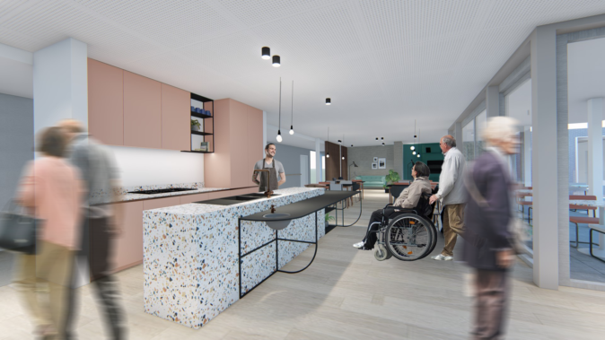
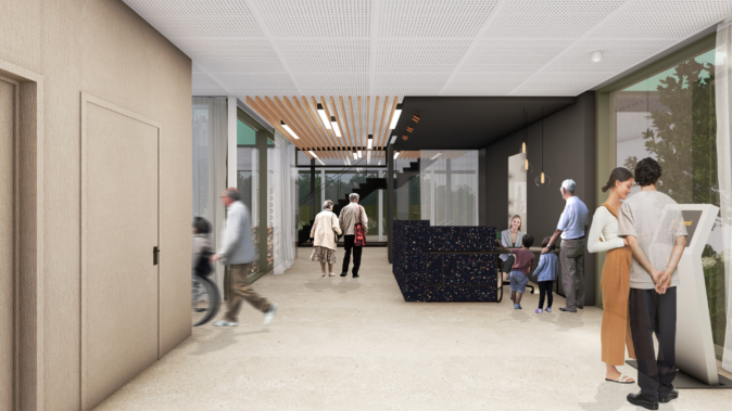
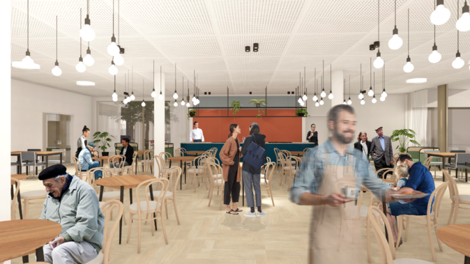
The rooms are spacious, providing maximum design freedom. The entrance area and the bathroom are of course fixed, but due to the limitation of fixed furniture and flexibility in the technologies, the living and sleeping area can be freely defined.
For the materialization, a light-coloured facing brick was chosen, as a nod in the direction of the existing building. The horizontal joints are recessed and thus create a narrow horizontal line in the façade. On the ground floor, the public area on the boulevard is entirely glazed. The overhanging upper dwellings and the open spaces between them form a long canopy, with an opening here and there for greenery, light, and air. The construction of a transparent volume with clearly recognisable dwellings above and behind it, in combination with a balanced facade design, makes the building very legible. To achieve a varied facade, a rhythmic design was chosen with windows classically positioned set back from the facing brick and windows with a projecting-coloured aluminium frame.
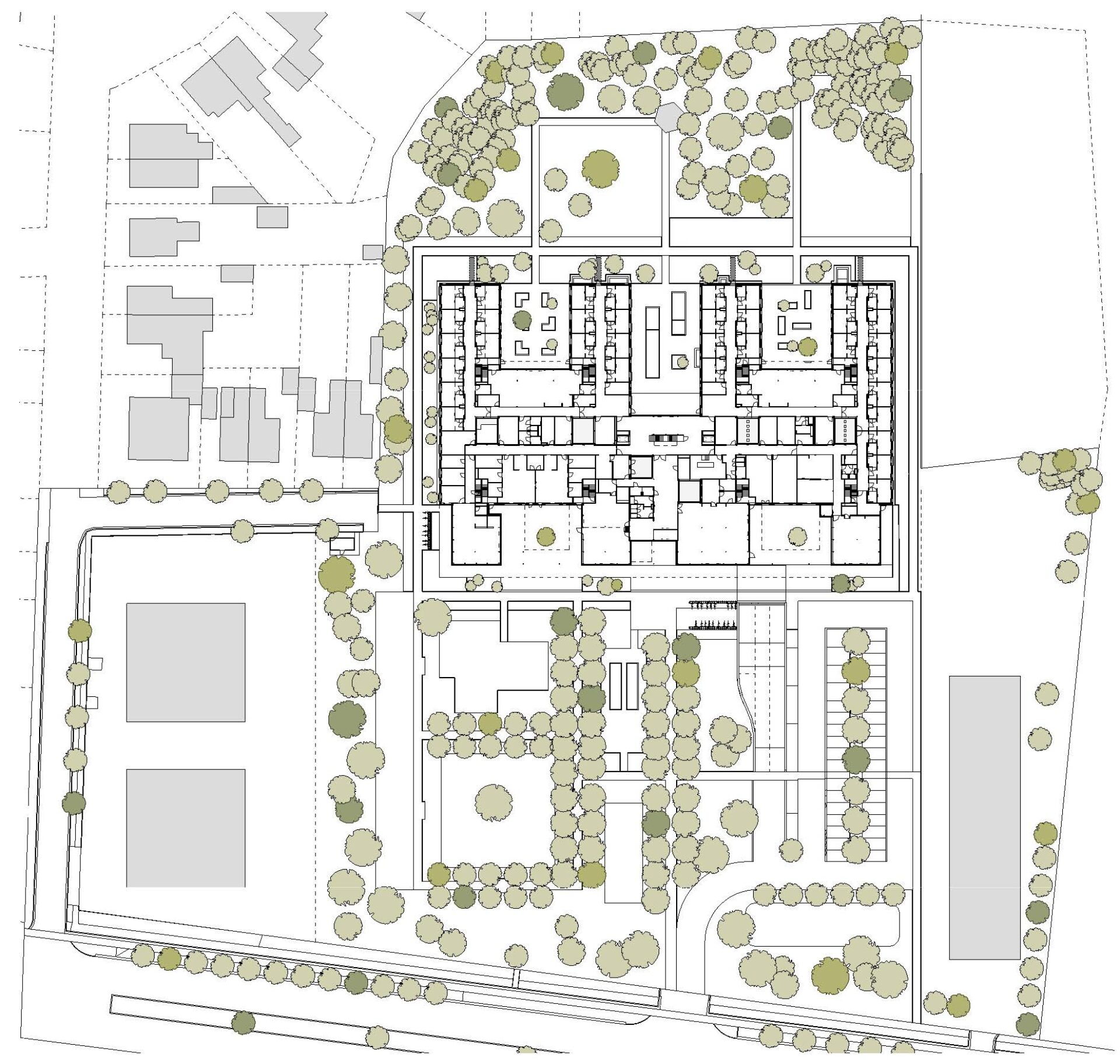
configuration of the new situation
Great attention was paid not only to visible materials, but also to invisible elements, such as the logic of the supporting structure and the use of renewable energy. Due in part to a borehole energy storage field under the cellar, solar panels, and solar water heaters, the building will be able to obtain BEN (“Almost Energy Neutral”) certification.
The building, technologies, and environment were fully developed in a BIM model, shared with all tenderers in an open format, with the necessary legal justification during the tender process. This resulted in a very clear tender procedure.
BEN (“Bijna-Energie-Neutraal” or “Almost-Energy-Neutral’)
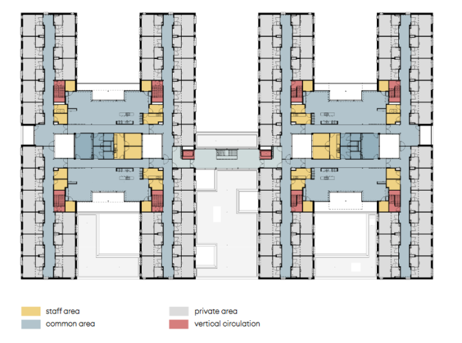
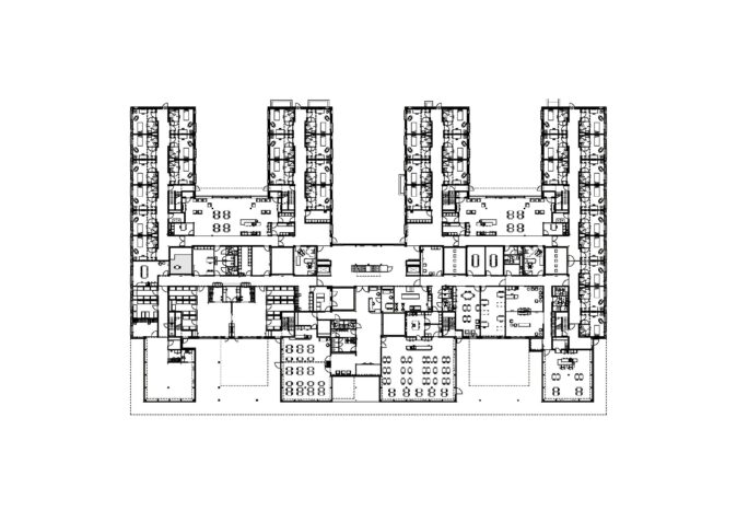
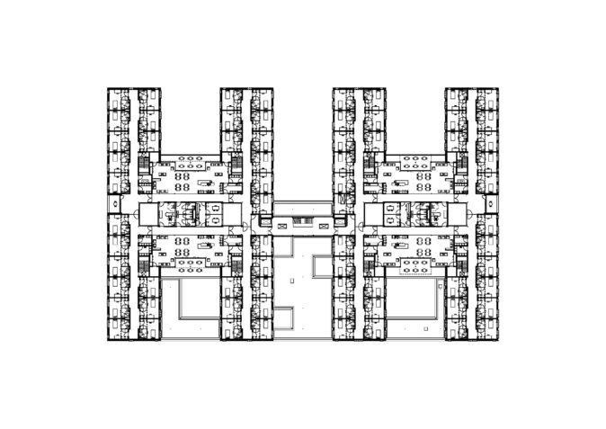
ground plan level +0 ground plan level +1
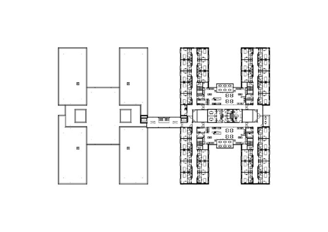
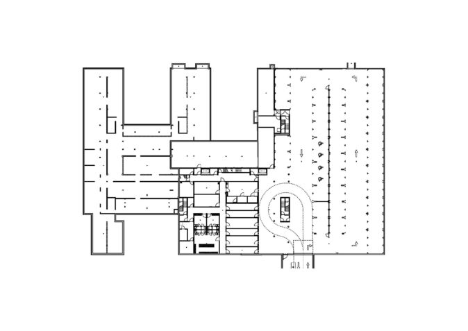
ground plan level +2 ground plan level -1