from the obsolescence of a 1970s office building to the performance of contemporary multipurpose workspaces
from the obsolescence of a 1970s office building to the performance of contemporary multipurpose workspaces

The North Brussels district was the emblem of modern urbanisation in the 1970s, which was imagined as a new “Brussels Manhattan”. The vast monofunctional office complex, with no mixed use, consisted of 750.000 m² of buildings. This “modernist” urbanisation model quickly showed its limitations and it took less than 40 years for it to begin a real decline in attractiveness. Compared to the city centre, which is more lively and better served by public transport, the northern district, which consists of buildings with a high capacity in terms of m², is gradually losing its occupants and is becoming empty, and even unsafe after 6 p.m. Building no. 7 on Boulevard Albert II, which was invisible in the overall perspective, as it lacked any character and was located in a semi-detached building with a uniform curtain wall façade, was paying the price for this lack of interest and gradually losing all its occupants. At the time, the building was part of an imposing and static complex. The building was bought by Triuva, a German investment fund, but no-one was interested in buying it, so the fund commissioned assar to carry out a renovation project to make the building “sexier”.
| program | complete renovation of the building passive building for office & co-working space for Fosbury & Sons |
| client | Downtown Real Estate & Baltisse |
| address | boulevard du Roi Albert II, 7 • 1210 Bruxelles |
| building type | work |
| status | completed |
| expertises | architectureproject managementconstruction managementprogramming |
| offices | brussels |
| size | 15.400 m² |
| team | • client: Downtown Real Estate & Baltisse • architect: assar • interior architect for Fosbury & Sons: Michiel Mertens, Going East • building services: CES • general contractor: MBG • facades: Hermans |
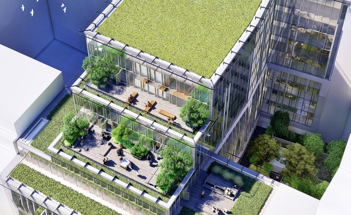
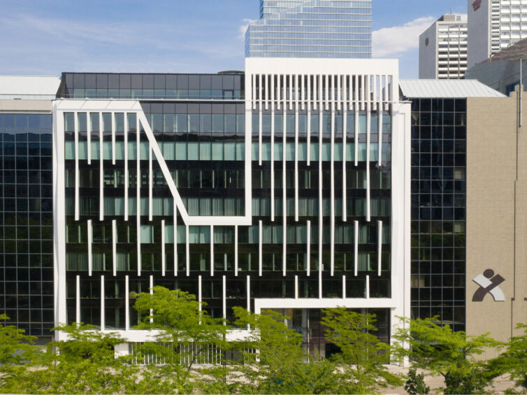
assar proposed a sustainable renovation for this 15.400 m² building (energy, insulation, wood-aluminium curtain wall façade, photovoltaic cells, passive building criteria, etc.), as well as functional (multi-use shared ground-floor, change in distribution, opening up between floors, an opened up character and open to the streets of the ground floor, etc.). Originally, the building, which dates from the 1980s consisted of a curtain wall façade to the north, which was dark and in shadow for most of the day (darkened glazing, black curtain wall). The overall effect was a dull mass in the urban context. assar therefore imagined a real highlighting of the façade by working on the theme of a white cliff. Associated with the northern district, the metaphor of a glacier cliff gives new life to the building, which has become visible from the entrance to the boulevard. Named “Polaris” by the developer Triuva, the latter did not ultimately launch the renovation due to the lack of a candidate occupant.
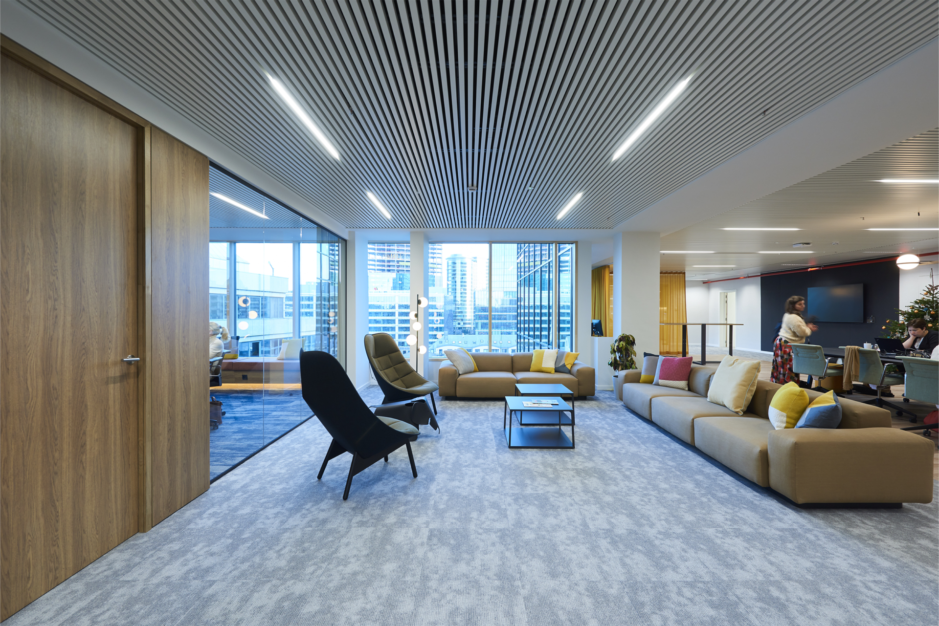
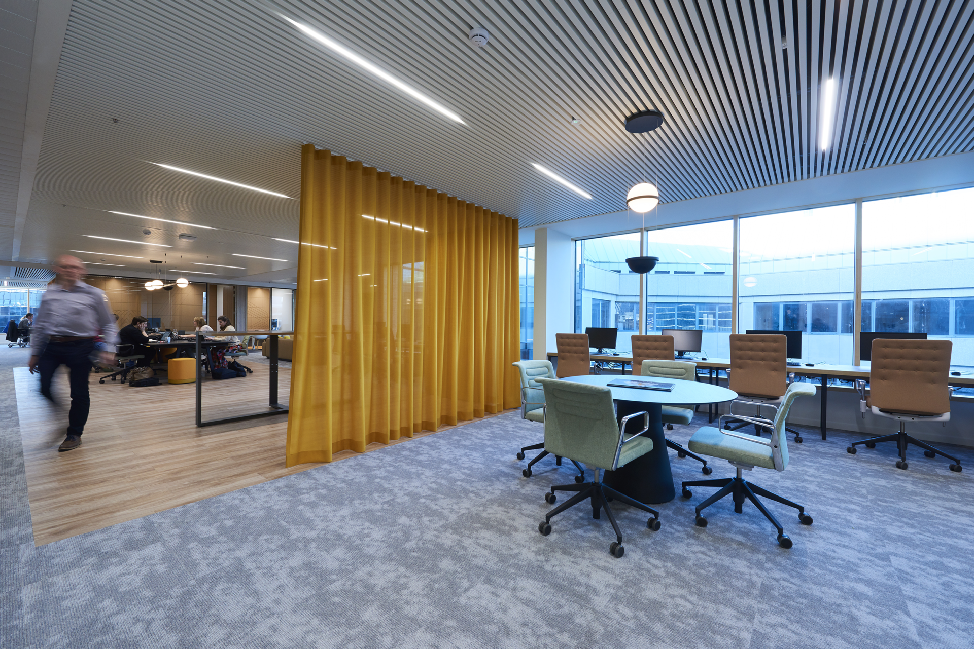
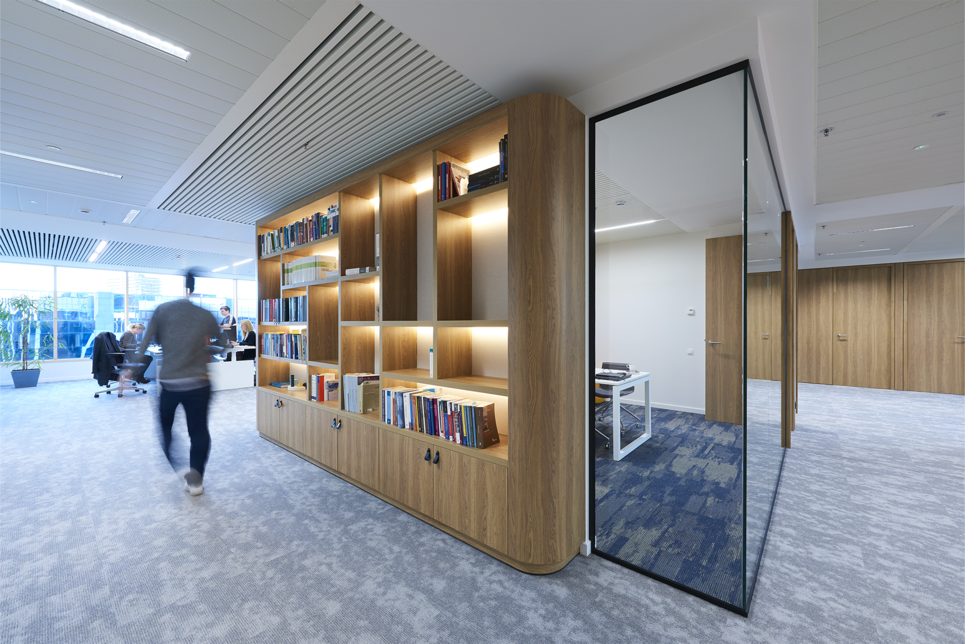
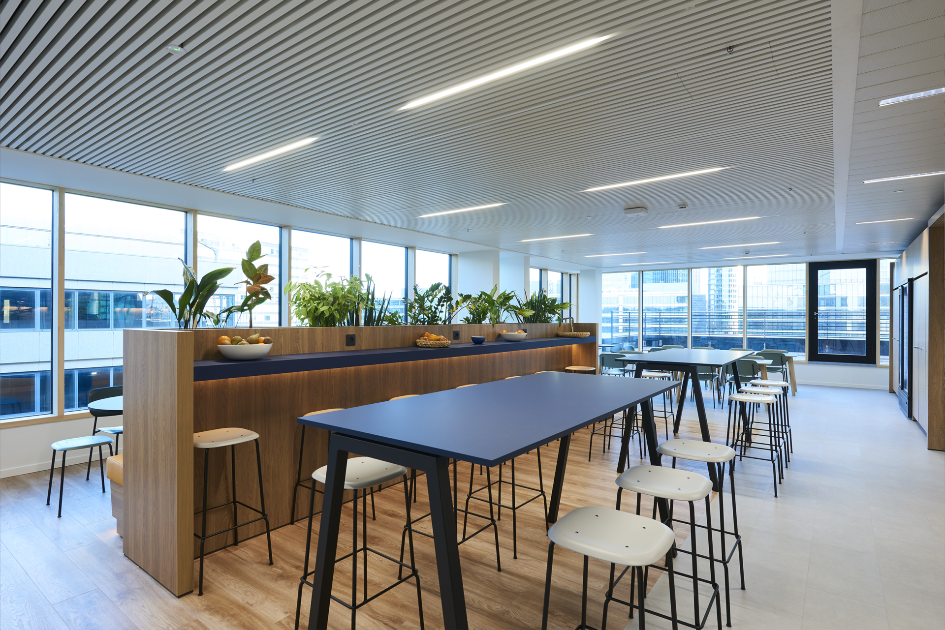
It was at this point that the young development company Downtown became interested in acquiring the building with a new occupancy dynamic. Strongly aware of the need to change the workspaces, Downtown saw an opportunity for creating a new co-working hub by incorporating the company Fosbury & Sons on the 3 lower levels, including the ground floor. Designed as an open and attractive social space, Fosbury’s presence attracted occupants to the other floors. Downtown achieved a tour de force by finding functional complementarities between the occupants. Thus, the shared spaces in Fosbury (meeting rooms, restaurant, workstations, etc.) are occasionally hired by companies in the building and even by neighbours who find new complementarities in the structure, without the need to expand. We are completely committed to this vision of mixed use within the same building. Just as we were convinced that the Downtown approach was promising and should be applied on a recurring basis in renovation projects and in new buildings. Opening up the ground floor is one of the keys to a lively planning dynamic, increased social ownership, and user-friendly urban spaces. The renovation was efficiently carried out by the general contractor MBG together with the façade contractor Hermans. A special mention goes to the duo of contractors who carried out the renovation, and in particular to Hermans, who took up the challenge of a wood/aluminium curtain wall combined with the sculptural 3D relief of white lacquered folded sheet metal.
• base: bluestone & white aluminium sections
• curtain wall: mixed curtain wall (wood on the inside) & black powder-coated aluminium on the outside
• façade relief: white powder-coated aluminium sections
• glazing: triple glazing (vision glazing) with high solar factor & double glazing (spandrel glazing).
• coefficient: CO2 emissions kg/m²/yr.: 35
• certification: BREEAM Excellent, Nearly Zero Energy building,
PEB: B (65)
The objective of the project was to obtain BREEAM Excellent certification and to meet the requirements of the Brussels-Capital Region’s “passive buildings 2015”.
The measures adopted to achieve the required passive criteria were:
• optimal building inertia (active suspended ceilings with open modules)
• reinforced insulation in the facade (spandrel), slab over the car park & roofs
• treatment of thermal bridges
• an excellent level of air tightness
• the selection of high-performance triple glazing
• the production of renewable energy by photovoltaic panels on the roof
• 15,400 m² of passive office space, spacious & bright (large windows, high ceilings and superb views)
• 127 parking spaces, facilities for cyclists & 20 charging points for cars & electric bikes
• triple glazing: high performance
• a co-working space with a range of facilities
• tenant facilities & a restaurant managed by Fosbury & Sons
• outdoor green terraces & a restful garden
• natural & sustainable materials with customised high-end finishes
