new residential care facility (120 beds) & community services centre
new residential care facility (120 beds) & community services centre

In November 2011, following a public competitive tender, assar were selected to design the residential care facility on the site of the “Gerda” football fields, on behalf of the Sint-Niklaas CPAS [Public Social Action Centre]. The jury was particularly interested in the evolution of the project model with which the Sint-Niklaas CPAS was already acquainted at the De Spoele residential care facility, a project also developed by assar. The CPAS was particularly attracted by the pursuit of a more efficient functioning in small living groups and by the innovative design of the sanitary units in the individual rooms.
| program | new residential care facility (120 beds) & community services centre |
| client | CPAS Sint-Niklaas |
| address | Gerdapark 13 • 9100 Sint-Niklaas |
| building type | care • live |
| status | completed |
| expertises | architectureinterior architecturebimlandscape designurban design & planningproject managementhealth & safety coordinationprogramming |
| offices | brussels |
| size | 11.671,45 m² |
| team | • client: Sint-Niklaas CPAS • structural engineering: Fraeye & Partners • technical engineering: Technum • external approaches: Stramien • contractor: Cei-De Meyer |
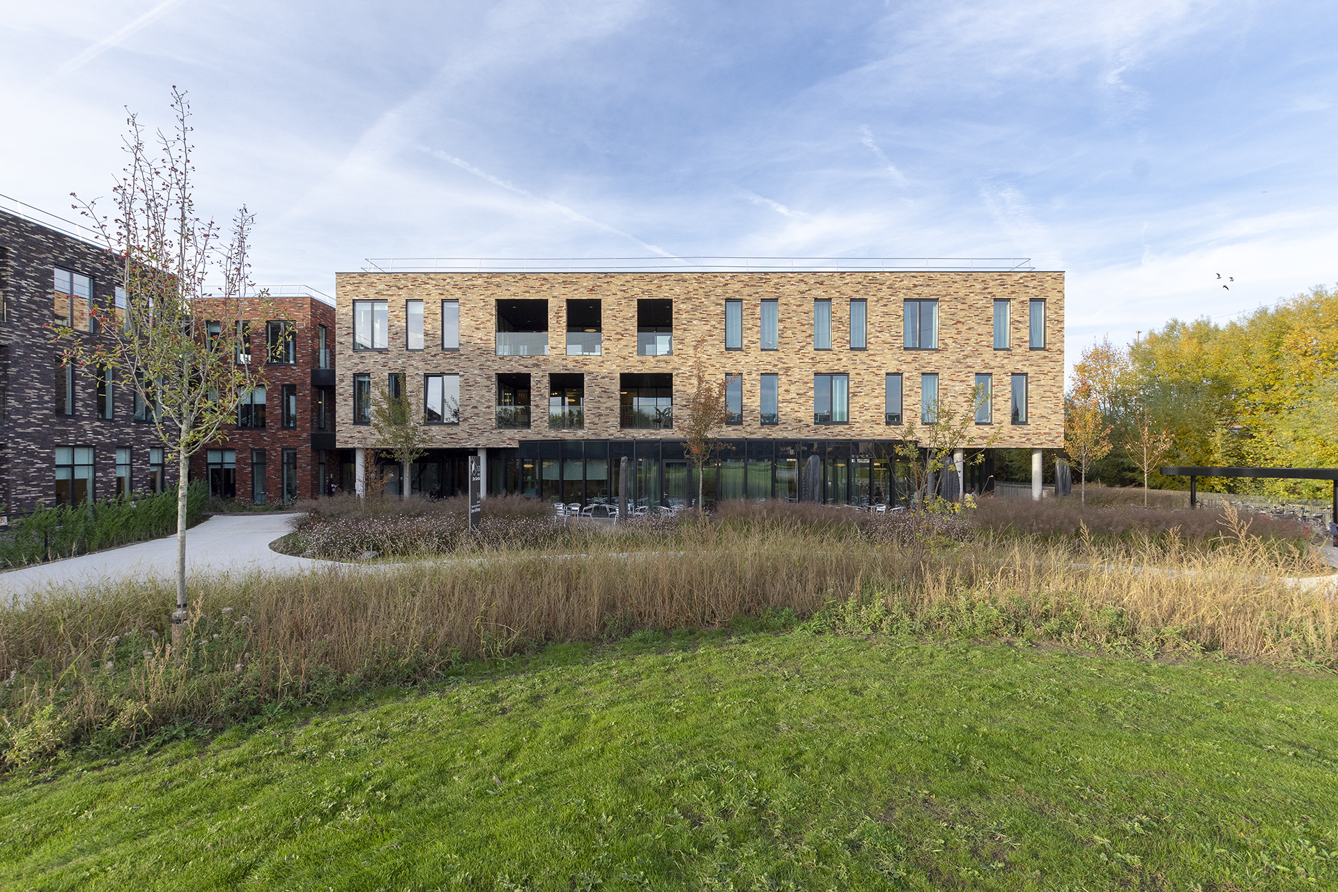
The competitive tender design project remained almost unchanged from the current project and was executed within the budget limits (+2% between 2013 and 2017, on the index). This is an excellent example of the quality of the drafts with which assar participates in competitive tenders.
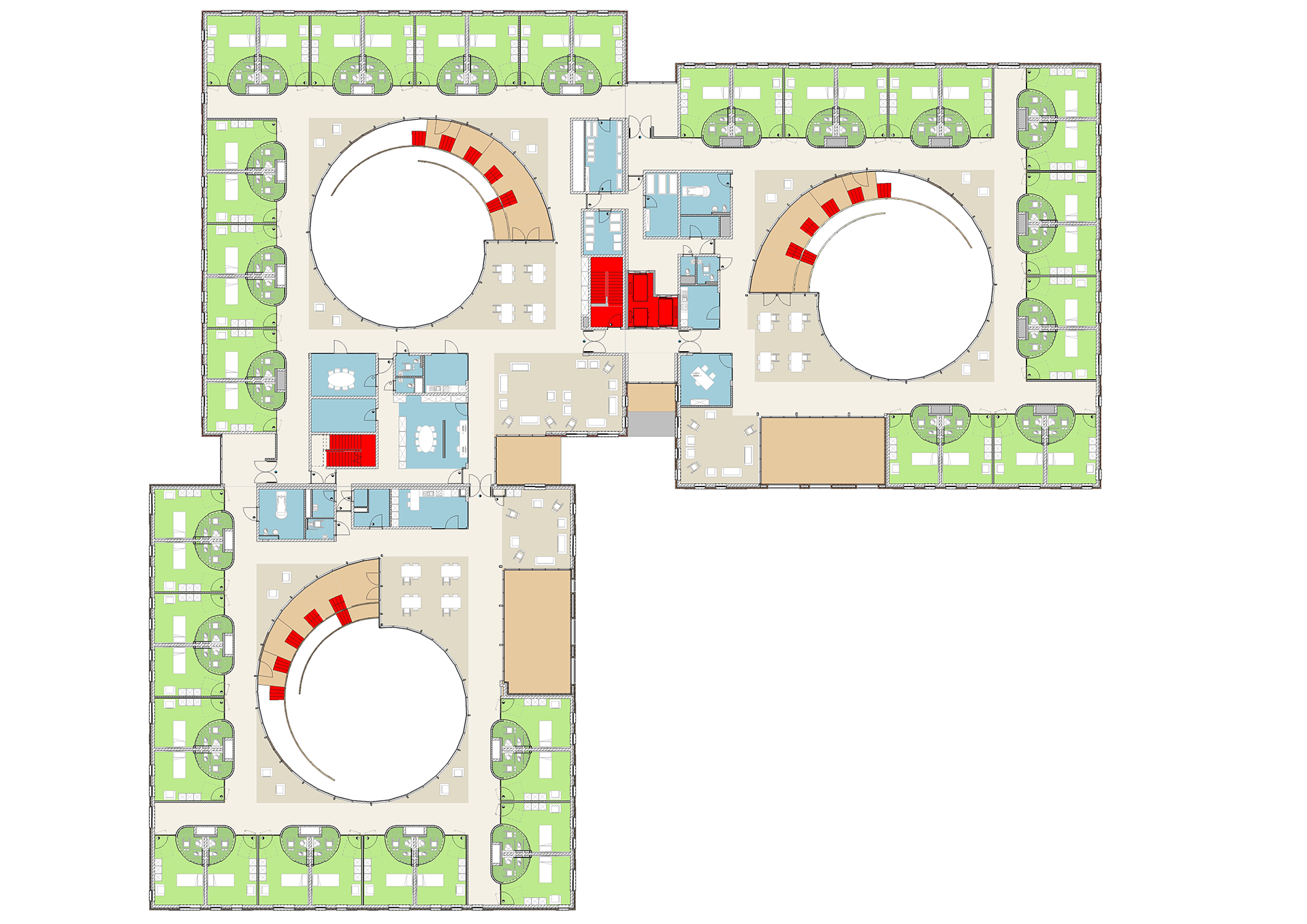
The Gerda residential care facility project is a continuation of the pursuit of the ideal balance between a compact, energy-efficient building and the need to create a modestly sized living environment. The model was first used in the “Gouden Anker” (a cube with central interior space) and further developed in the residential care centre projects at Yserheem, Broekpoort and De Spoele (beams and cubes with central open space(s)). Gardens and central open spaces are essential in a compact building: they provide ample light and air in the central interior area.
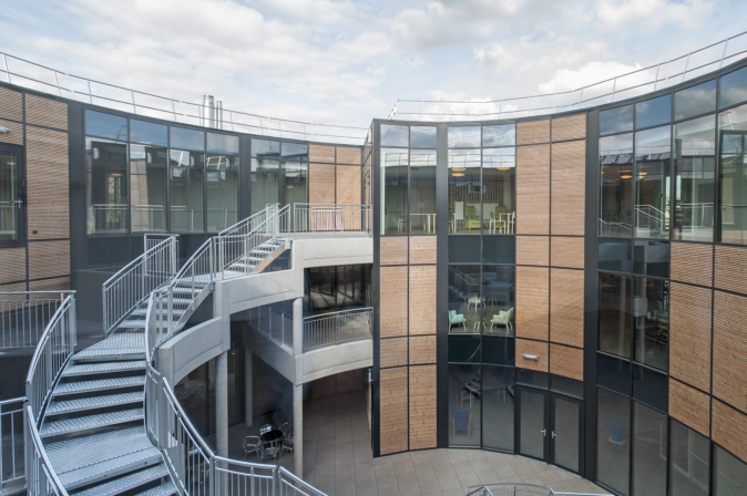
In the evolution of this model, we wanted to add value to the interior spaces by not limiting their enjoyment and use to the ground floor. The terraces in this area (as in Yserheem) seemed to be a good start, but with the three-dimensional spiral development of the interior space, we hope to connect the floors with suitable vertical walkways.
Through extensive prefabrication and the fact that we developed the spirals so that they could also be used as fire escapes, the execution of the interior gardens remained within the prescribed budget, without compromising the quality of the other parts of the building.
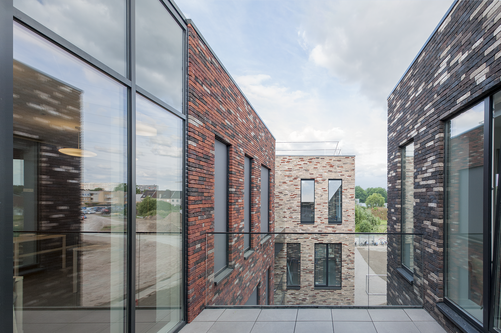
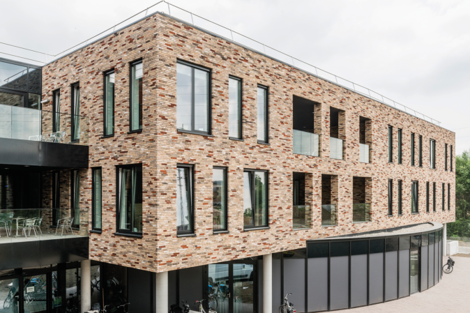
This project constitutes an investigation into the areas of tension that exist when designing a residential care facility of this scale. On the one hand, it is necessary to build compactly in order to minimise loss of surface area (energy-efficient construction), to deploy the nursing staff efficiently (walking distances) and because of the existence of an underground car park (optimisation of the foundations and the roof). On the other hand, the impact of this volume on a building site surrounded by small single-family dwellings must be taken into account. In the building itself, a balance must be found between the modest size inherent in the habitat and the deployability of the caregivers of the residents requiring care.
A fruitful collaboration was developed with the designers of the surroundings, the Stramien design office. Both designers strongly advocated their role in the overall master plan for the Gerda site. This dialogue resulted in a coherent whole, with a good balance between the needs of a contemporary residential care facility, and the very successful construction of a public domain in the surroundings.
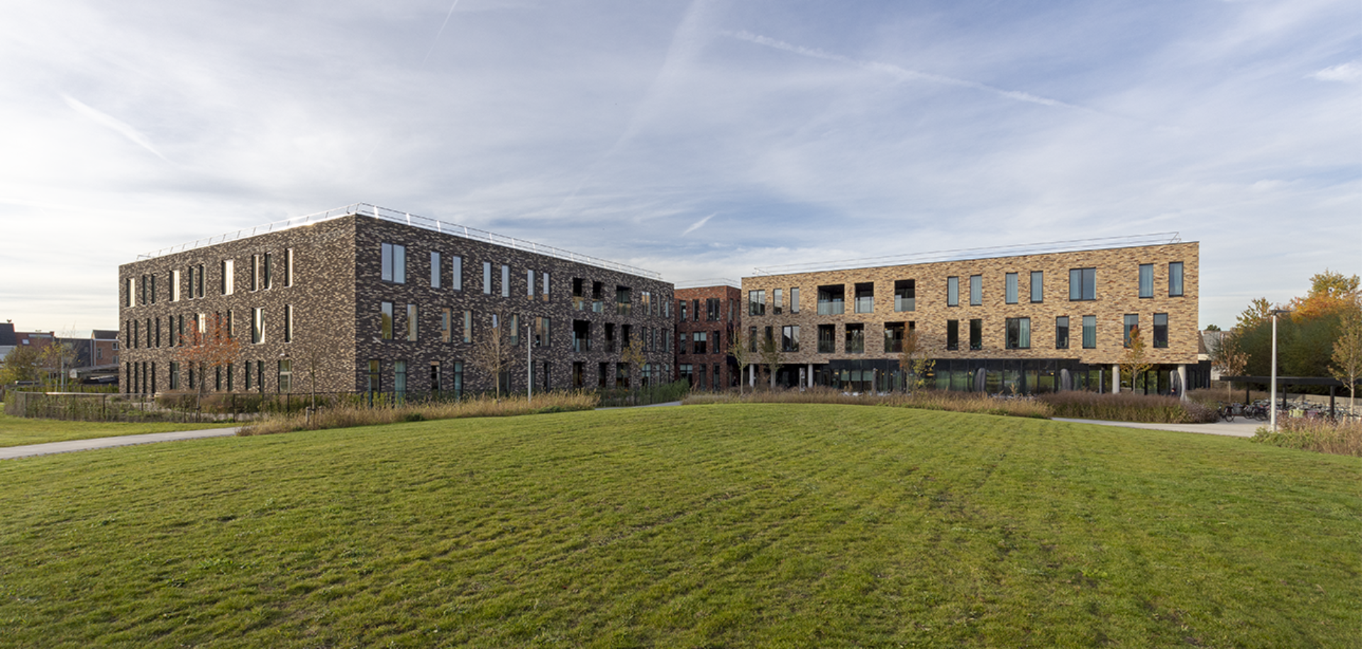
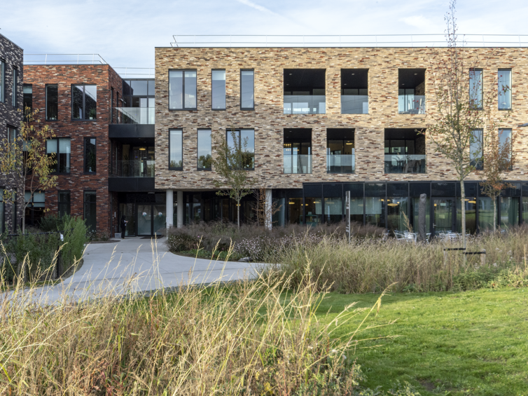
The public elements of the residential care facility are seamlessly integrated into the landscape architecture. The round Bolakkers, which form the common thread of the landscaping, are balanced with the round shapes of the snail shells and the entrance block. The two projects systematically merge into each other and use the same language of form.
By distributing the day rooms randomly in the spaces around the “snail shells”, it becomes possible to live in changing groups of residents. Depending on their care patterns and affinities, the space enables groups, whether directed or not, to be nested. Plants, screens, and furniture enable the living space to evolve with the needs of the residents and their carers. In particular, residents with dementia are never confronted with corridors of finite length. Clearly recognisable rest areas line a varied route, which can be followed within a section or across all components.
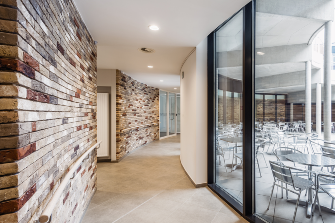
The facades of the building were designed in classical materials such as masonry and bluestone, which harmonise perfectly with the green residential environment. The colour shades of the masonry and the use of three different colours reflect the modest scale of the project, from the interior to the exterior.
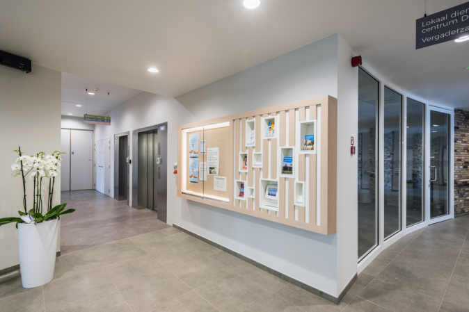
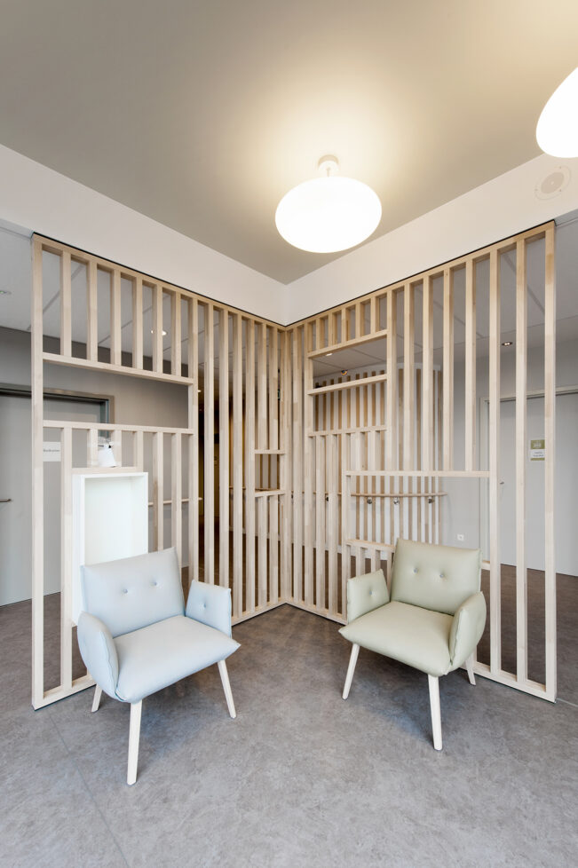
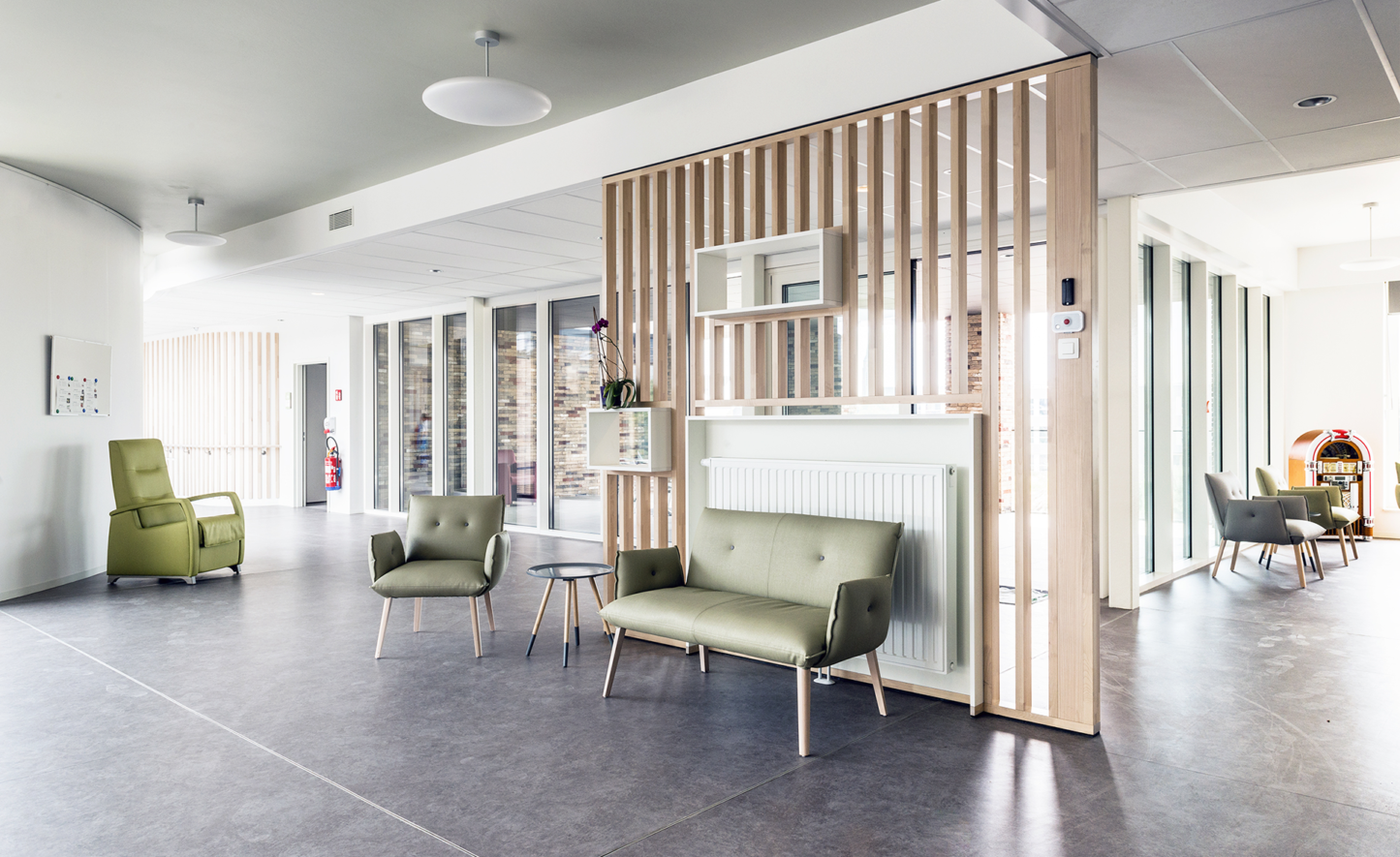
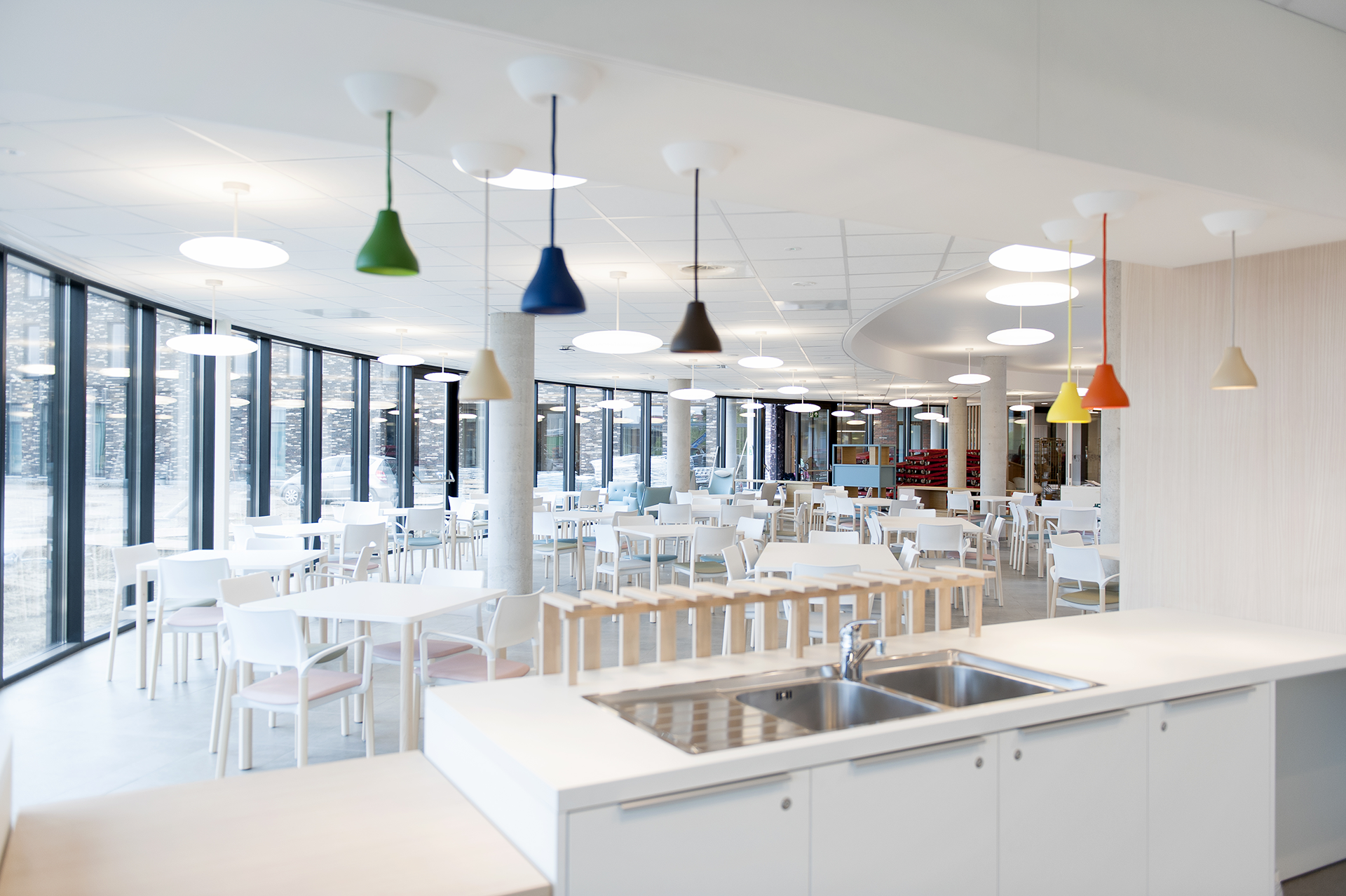
For the interior, fresh and bright materials were chosen. They maximise daylight and create a warm atmosphere. The semi-public area on the ground floor was kept as open as possible, with transparent wooden partitions as structural elements.
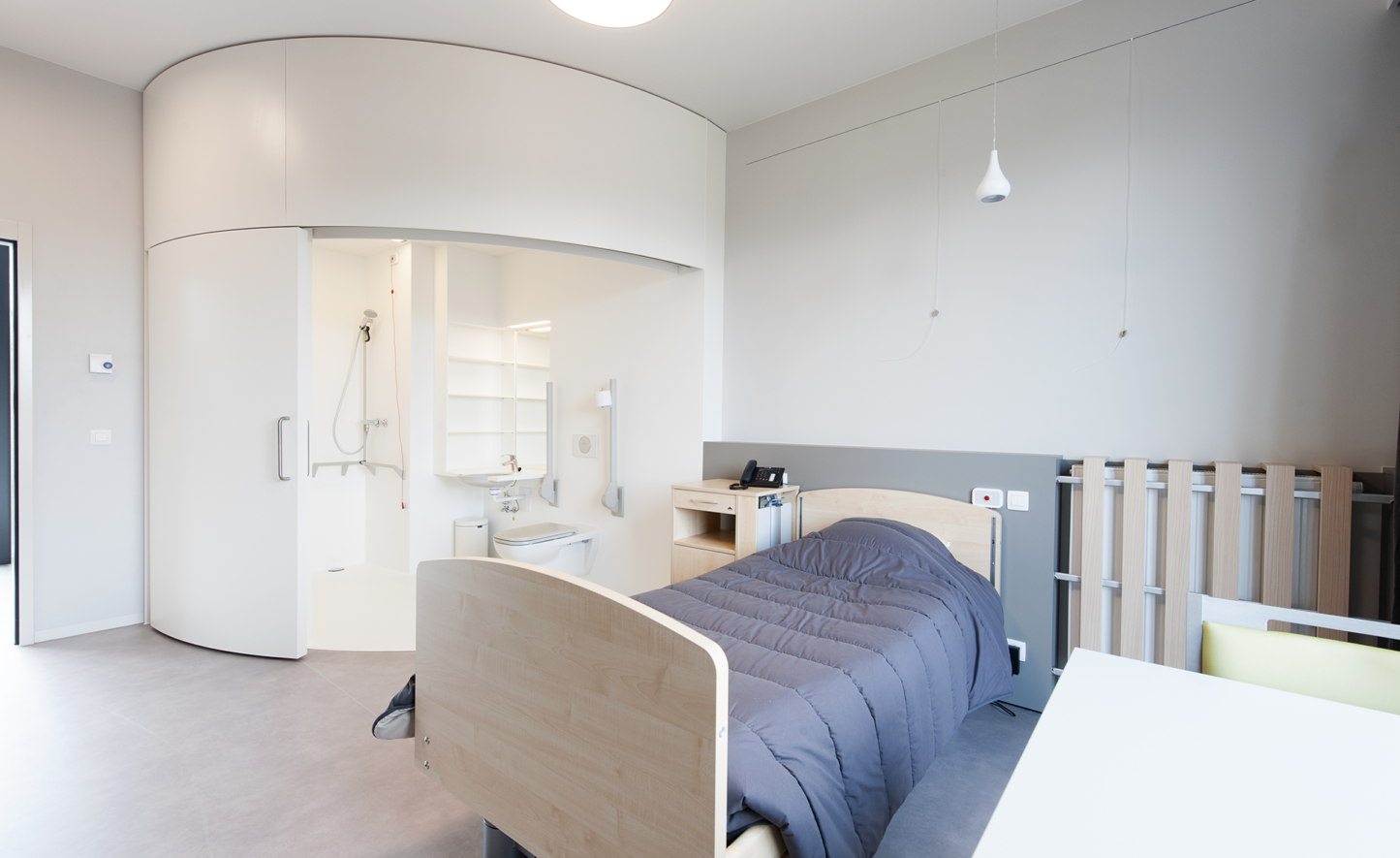
A specific sanitary unit has been designed for the bedrooms, with a large, curved sliding door. All sanitary appliances are perfectly integrated into the walls and floor, by using Solid Surface as the only finishing material. The costs of this unique project are largely recouped through its ease of maintenance and use.
With its compact design, the surface area of the façade – and therefore the energy loss – is minimal. This is further enhanced by the use of thick insulation packages and triple glazing. The risk of overheating is reduced by the automatic external sun protection. The building is also equipped with solar collectors for hot water and energy-saving LED lighting.
